


Outliers in a collection of data are the values which are far away from most other points. A boxplot is usually used to visualize a dataset for spotting unusual data points. However, is an outlier abnormal or normal? It needs to be decided by data analysts.
The boxplot displays five descriptive values which are minimum, \(Q_1\), median, \(Q_3\) and maximum.
The First Quartile and Third Quartile
Place a sample variable into ascending order. Split the sample set into two halves. The first quartile, denoted by \(Q_1\), is the median of the lower half of the set. This means that about 25% of the values are less than \(Q_1\).
The third quartile, denoted by \(Q_3\), is the median of the upper half of the set. This means that about 75% of the values are less than \(Q_3\).
\(IQR\)
An interval, IQR (Inter-Quartile Range), is calculated as the difference between \(Q_3\) and \(Q_1\).
Outliers
IQR is often used to filter out outliers. If an observation falls outside of the following interval,
$$ [~Q_1 - 1.5 \times IQR, ~ ~ Q_3 + 1.5 \times IQR~] $$
it is considered as an outlier.
Boxplot Example
It is easy to create a boxplot in R by using either the basic function boxplot or ggplot.
A dataset of 10,000 rows is used here as an example dataset. Two variables, num_of_orders, sales_total and gender are of interest to analysts if they are looking to compare buying behavior between women and men.
Firstly, load the data into R.
sales <- read.csv("data/yearly_sales.csv")Select the variable sales_total and inspect the variable by calling the function summary:
summary(sales$sales_total) Min. 1st Qu. Median Mean 3rd Qu. Max.
30.02 80.29 151.60 249.50 295.50 7606.00
The summary function returns all the five descriptive values for the variable sales_total. Run summary on gender too.
summary(sales$gender)F 5035
M 4965As gender is a factor of two levels, F and M, the summary function returns the number of each level.
Boxplot by using boxplot
The following snippet will create three boxplots of sales_total by the basic R function boxplot. Each boxplot has a specific aesthetics setting
 1slug: outlier-boxplot
 2# set up a layout for plotting
 3mat <- matrix(c(1,2,3), nrow=1, ncol=3)
 4slug: outlier-boxplot
 5layout(mat)
 6# 1. boxplot for all customers
 7boxplot(sales$sales_total, pch=19, xlab='F and M')
 8# 2. boxplot for all customers, log scale
 9boxplot(sales$sales_total,pch=19,log='y',xlab='F and M',ylab='The Log of sales_total')
10# 3. one boxplot for each gender level group, log scale
11boxplot(sales$sales_total~sales$gender, pch=19,log='y',col='bisque',xlab='Gender',ylab='The Log of sales_total')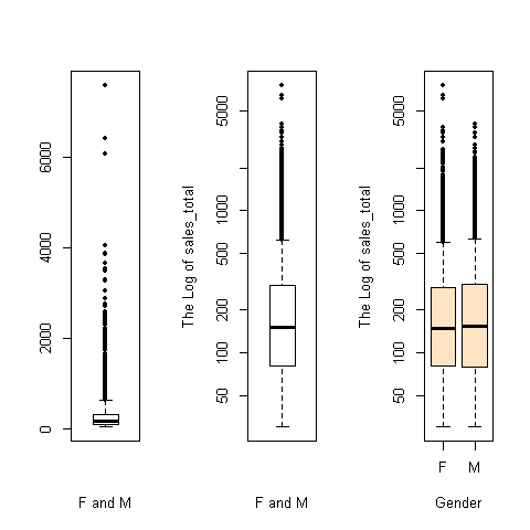
Boxplot by using ggplot
install.packages(“colorspace”)
 1# BOXPLOT BY GENDER GROUP
 2library(ggplot2)
 3library(Rmisc)
 4
 5p1 <- ggplot(data = sales, aes(x=gender, y=sales_total)) +
 6            scale_y_log10() +
 7            geom_point(aes(color=gender), alpha=0.2) +
 8            geom_boxplot(outlier.size=4, outlier.colour='blue', alpha=0.1)
 9
10plot(p1)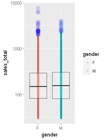
Jittering
Noticeably, there is the problem of overplotting with the points in both boxplots. Often, we can add a little random noise to the points, referred to as jittering data. In the geom_point layer of ggplot, assign jitter to the parameter position, which is shown in the following ggplot snippet.
p2 <- ggplot(data = sales, aes(x=gender, y=sales_total)) +
        scale_y_log10() +
        geom_point(aes(color=gender), alpha=0.2, position='jitter') +
        geom_boxplot(outlier.size=5, alpha=0.1)

plot(p2)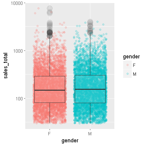
Share this post
Twitter
Facebook
LinkedIn
Email